Everybody seems to loves these inset bars.

The thing is, they're one of the easier things to make, so here I'm going to both tell you how, and provide several versions in different colors for the lazy ones out there.
(You know who you are...)


Here the piece, "3bar3grey.gif" is shown against a white background, and here's a couple of close-ups of just what makes 'em what they are.

Let's start out with a 2 layer Photoshop document sized at 24x564 pixles. The 'background' layer gets filled with the average color of your WWW background image, and the top one is blank for now.

Working on the top layer, start with a foreground color of black. Using the 'marquee' tool to create a box 3 pixels tall, by 540 pixels wide. Use the "Marquee Options" pallette to set the rectangular selection at a fixed size. This way you can click on your image, and drag the selection around, it's not fixed until you let go. Watch the "info" pallette, and set it up with the top left corner at an X,Y of 12,10. Fill it with the foreground color of black (option+delete).


(This is the important part!)

DON'T de-select yet! Keeping that same selection, go to the bottom layer, and choose "select/feather..." at a width of 1 pixel.

Using your arrow keys (command+option+arrow), push that selection down one click, and right one click. Choose "Image/adjust/brightness" (command+B), and adjust the brightness up by 100%.

Use the arrow keys again, and push the selection up 2 pixels and left 2 pixels, adjust the brightness down by -100%.

Now all you need to do is flatten the image, reduce it to indexed color, and save as a transparent GIF89a using the background color as transparent. This is as far as you *need* to go, but I'm now going to direct you to the Transparency2 tutorial to see how to get that pixellated shadow. Have fun!


This isn't all you can do with this technique, this is only the simplest use for it. This is the quickest technique for doing minor 3D, such as the insets on many of my controls. The header for the "Hands-ON" section, the 'top' and 'back' text, you can do a lot of different things with this one, easy tip.

Here's 4 examples of what you can do with this, technique, limited only by your imagination. Have at it!


Here's another bit of handiness. You've got your GIF89a file, and it works great on your present background. So what happens when you change backgrounds? It's easy to change the color of these GIFs, here's how...

Open up the original GIF, in this case "540grey.gif". Change your color depth from "Indexed Color" to "Greyscale". This purges the color from the piece. Now change your mode again to "RGB" and we're ready to work. Create a new layer, and fill it with the average color of your new background. Set the mode of that layer to "color", which will colorize your image to that tone. When you flatten this image back to indexed color, Photoshop will by default show a setting of "exact", with a certain number of colors, (47 for this image). You haven't introduced any new tonal ranges with this effect, you've just changed the value of this pixels. Trust Photoshop in this case, there's no sense re-dithering.


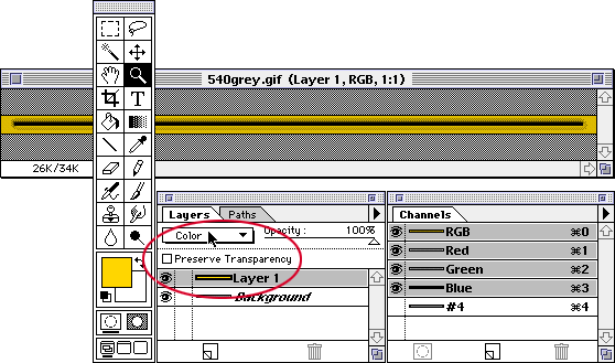
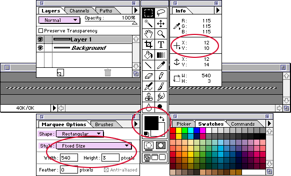
"540grey.gif", 808bytes, for backgrounds averaging a BGCOLOR of #737373.

"540gold.gif", 808bytes, for backgrounds averaging a BGCOLOR of #AA7700.

"540taupe.gif", 808bytes, for backgrounds averaging a BGCOLOR of #7E7869.

"540blau.gif", 808bytes, for backgrounds averaging a BGCOLOR of #5555BB.

"540grun.gif", 808bytes, for backgrounds averaging a BGCOLOR of #339933.

"540red.gif", 808bytes, for backgrounds averaging a BGCOLOR of #AA4444.


Entire contents copyright ©1994-98 by Doctor Thaddeus Ozone, all rights reserved.


Getting the average to your background file is easy. Open the background, and give it a "Gaussian Blur" of 32 pixels. Do it a couple of times, so it all looks the same. Now take your eyedropper tool and select that color. You can dump it into your pallette for later use. You'll also want to note down the RGB code for that color, so you can translate that into #hex for use as your BGCOLOR.

Note! DO NOT use this image as a solid color, because it's not, really. It may *look* all like one color, but it's probably still a dozen, similar colors. That's what the eyedropper is for.

Another thing you DO NOT want to do is hit the "Save" key at this point. What a bummer to over-write your background image with a nearly solid color. Select "Do Not Save..."


Entire contents copyright ©1994-98 by Doctor Thaddeus Ozone, all rights reserved.