How to make

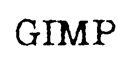
OK, let's get started. This tip obviously doesn't work the same with every font or every font size...you will need to apply some judgment on the numbers. Your mileage may vary. The Typewriter font is a very good one to use; let's make our favorite logo in 80 pixel Typewriter font:
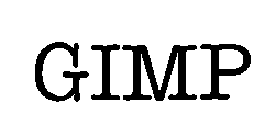
1) GIMP
You'll soon realize why we didn't bother to anti-alias it. Now, the concept here is to randomize the edges of the font, without really breaking it up or getting a lot of scattered pixels. The best way to do this is to Spread the pixels out a bit:
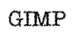
2) GIMP with Spread applied at 2, twice.
Why use a Spread of 2, twice? Well, take a look at what happens if you use a value of 3, once:
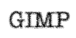
2a) What the hell is this?
As you can see, there's some kind of mathematical bug in the code that's giving the spread a completely artificial-looking distribution. By using 2 (which looks pretty normal) and using it twice in a row, we get a correct looking effect. Tip: Kai's Power Tips taught me this. Read them. Read them again.
You may be saying to yourself, "Wait. He said we didn't want to break it up or get lots of scattered pixels. Then why the hell did we spread it out like that?" Well, because there's a filter that will glue this stuff all back together again. It is the magic of Gaussian Blur:
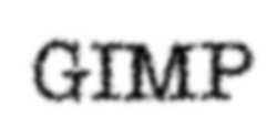
3) Gaussian Blur on 2) at 2.0 radius
I'm sure you can see what's coming. You always were the smart one. I bet you blurted out the ending to murder mysteries before anyone else had figured them out. Well, you're right, of course...we're going to use the newly written plug-in called Threshold to create the right look for our text. Since Threshold lets us adjust the filter with a preview, we can tweak it for just the right amount (I used about 120...your needs may be different):
4) Voila! That's rough stuff!
In case you didn't already know it, Threshold examines each pixel's brightness value. If it's above a certain user-specified value (the "threshold"), it raises the brightness all the way up to the max (white). If it's below the threshold, it turns the brightness all the way down to zero (black). The output of threshold on grayscale images is always a pure black and white image.
And there you have it! If you want to get REALLY tricky, you can even tweak the letters of the font a bit, to make it look like it is from an off-kilter typewriter. Rotating is also good...see the "Rough Text" logo for this page. Tip: You can make small adjustments VERY easily by using the arrow keys with a selection. You can move selections 1 pixel in any direction that way. This may be documented, but I'm telling you again to reinforce its usefulness.
If you like these tips, or even hate them, or if you are indifferent towards them, please tell me so.
Happy GIMPing!
Zach