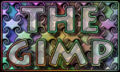

The swirly pattern was created in the same way as my "Creating a tileable pattern (00)" tutorial. From there a shadow mask was made and a blurred version of itself was used with the Lighting Effects plug-in (against another plasma clouds image) to create the 3D-ish look on the pattern. The original swirly pattern image was used as a compositing mask to overlay the 3D pattern onto the bottom `sand' image (which had been previously multiplied by the shadow mask, of course). To create the think black outline of the pattern, I used the tip which appears at the bottom of my "Creating a watermark effect" tutorial.
Then I created a grayscale text image with "The GIMP" text on it, and used my watermark tutorial to make the semi-transparent light text. The colored borders of the text are a variation on the outline tip... they were created by using an Edge-detected version of the text as a bump map to apply Lighting Effects to yet another plasma clouds image. A slightly `thicker' version of the bump-map image was used as a compositing mask to overlay the colored borders on the text.
If you look carefully, you can also see that the text's outline casts a shadow over the swirly pattern and everything below. I forgot to tell you, that shadow was created based on the outline of the text, *before* the watermark effect was done :)
The thin black borders of the colored outline were done in the same
`outline tip' way. Of course this time I used the colored borders
themselves as the base image to create the black outline, *not* the
original text image. Finally, the outermost rounded border was done
in a similar way.
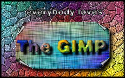
I created another image with Plasma Clouds, and used Zach's elegant tip for making it look as if it was done on a canvas cloth. I used my Page Curl plug-in to curl the corners of this image. Call this CANVAS.
Again, using Zach's tips, I roughened an image with the "The GIMP" text. I created a shadow mask using Kai's Power Tips, and multiplied it into CANVAS. I used a Plasma Clouds background and Lighting Effects with a blurred version of the rough text as a bump map to create the colored text, which I later Composited into CANVAS (now with the shadow, of course). Call this CANVAS (yes, substitute for the previous one!) :)
Using the fuzzy selection tool and the Selection to Mask function, I created a grayscale image with a mask of the CANVAS. I created a shadow mask out of this image and multiplied it into MOSAIC. I later used the same mask of CANVAS to composite CANVAS itself into MOSAIC. Let's call this MOSAIC2.
Then I used Zach's tip for creating punched-out text on MOSAIC2 (the "everybody loves" text). But it was difficult to distinguish from the background. So I decided to add a thin black border to the text.
I applied Edge Detection to "everybody loves" with a high value, to get a thin border. I Contrast Autostretched it (because it came out gray on black, and I wanted white on black), and inverted it to have a black background with a thin white border of the text. I multiplied this image by MOSAIC2, and the text looked much better with the thin border.
Then I created a white image in which the borders faded to black, and
multiplied it by the new MOSAIC2. All done! :)

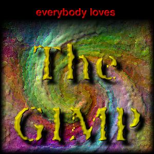
I used the Lighting Effects plug-in (which currently is still in beta state) to create the nice waves. Wow. Now we have some multicolored Japanese raked sand :) However, the image looked kind of grayish and unsaturated. Gamma and contrast adjustments would not help, so I created a grayscale version of the image and used my Extrapolation plug-in to extrapolate both images `away' from the grayscale version --- so the colors were saturated. This and other very useful tricks with extrapolation can be found at the Grafica Obscura home page (there is a pointer to it in the description of my Interpolate/Extrapolate plug-in).
Using one of Kai's power tips (there is a pointer to them in Zach's page), I created a shadow mask for The GIMP text, which I multiplied into the wavy sand.
To create the nice beveled "The GIMP" text, I first set some Utopia text (hell, it was the only PostScript font I had installed in the machine I used to create the image :) ). The text was set on a separate, grayscale image --- black text on a white background. I used one of Zach's tips (*yes* they are *that* great, you should check them out) to create a haloed text, but I did not multiply it by the original text image at the end, so that I would get white text with a purple halo.
I then used a blurred version of the original text image and the Lighting Effects plug-in (for some things it produces much more realistic results than my Bump Map plug-in) to make the bevels and shading.
Then I used a Thresholded version of the blurred text as a Compositing mask, to composite the beveled text into the colored sand image.
To make the red `dish', I just used the ellipse selection tool. Using a blurred version of it as a bumpmap, I used Lighting Effects to bevel it. Note that it is beveled to the `inside', so the bumpmap image was white ellipse and black background.
Setting the yellow "everybody loves" text was easy... bump map it, create a shadow mask, composite the whole mess into the red dish image.
Then I used another elliptical mask to composite the red dish with the text into the sand image.
Finally, I created a grayscale image with a white background, which in
the edges vanished to black (using the Blend (gradient) tool). I
multiplied it with the color image to create the final version.
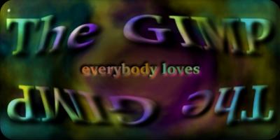
I converted WHIRL to grayscale and Gaussian Blurred it to create BUMPMAP. I used my Bump Map plug-in to bump WHIRL, and you *bet* it looked great! Somewhat like David A. Siqueiros' oil paintings (for people who don't know about this great contemporary Mexican painter, he used a similar `rough', thick style with his oil paintings). I used Enhance to more or less bring out the edges in this image. Call this the new WHIRL.
In a separate image, I set text for "The Gimp", and used Zach Beane's excellent tips for converting it into `old typewriter' style text (you know, all rough and irregular like if the ribbon in the typewriter was dirty), and to create a shadow mask image (for a nice drop shadow). Still keeping the selection active in the text image, I added the yellow gradient using the Blend tool. I Bump Mapped this text image with a Gaussian Blurred version of it, to create the nice 'ink' look. Using channel operations and the shadow mask, I composited it into WHIRL.
I Offsetted the image a few pixels down to make room for the "everybody loves" text. That text was easily created with the Text tool and a simple Bump Map (flat text is just too boring these days...).
But lo! The text didn't look good just put over the new WHIRL image,
so I used some quick channel operations and gradients to smoothly turn
the edges into black (and to make the black space above the "The Gimp"
text area). Finally, I composited the "everybody loves" text over the
whole mess to create the finished image.
In The Gimp, I created an equally-sized image with the words "The Gimp" both right-side-up and upside-down (image GIMP)... I duplicated the image and Gaussian Blurred it (a Bumpmap was coming) (image BUMPMAP). I created a version of BACK which was rotated 180 degrees, and I used GIMP as a mask to composite it with BACK again. This set the letters in the same clouds texture, but contrasting with the background (since the clouds inside the letters were not the same as their surroundings).
I used BUMPMAP as a bump map to Bumpmap the new BACK :) I re-applied the filter several times, so as to get a more rounded and `bold' bumping effect... it is *not* the same as using a larger bump value.
Finally I did more or less the same process with a "everybody loves"
image, but the bump map was now 'pushed into' our new so-mangled
BACK... of course, this was done by setting and blurring black letters
on a white background (remember, in my Bumpmap plug-in, dark is `low')
and light is `high').
This page last updated: 1996/06/05 11:22:29