Note:
To see this file correctly requires Word 4 or 5 with Times Roman font at 12, 18 and 24 points.
To see the imbedded sample pictures be sure to turn off "Use picture place holders"
They are a mixture of 1, 8 and 24 bit and some may appear dithered on 8 bit cards.
Requirements: Photoshop, should work with any version, menu descriptions are for V2.01
Author: Kai Krause, Curved Space*Design, Malibu
Contact: Send E-mail on Compuserve to: 71333,3542 or on Internet to: kai@aol.com. For comments, questions, further variations there is a corresponding folder on Compuserve in the Graphics area: Go Graphics>Graphics B Vendor+ forum>HSC or Go KPT.
#18 Secrets of Chops, Vol.3b
Compositing: Scissors & Glue of the 90s
Why?
Because I better continue where #17 left off, or I have an ugly mob on my hands...
In other words, you have to read the first part of this in #17 to really make sense of what follows.
So Now What?
1. To refresh some basics mentioned in KTP #1 and #2: The windows that show up in the pop-ups have to be the same size and mode (I.e. not Bitmap or Indexed)! Since we are working with duplicates of the original shape here you will see all windows in the pop-ups. If you are trying to include some other image (e.g. a scanned texture ) be sure to make it identical in size and mode. You can use Image > Resize to stretch other images, or Image > Canvas to position it in its original size in a window `canvas' of another specified size
Tip > you can use Canvas Size to quickly add a border around an image. Make the background color black and go to Image > Canvas Size... add 20 pixels to height and width, click Ok and voilá, a slightly larger window with a clean black border. And it contains the entire original image.
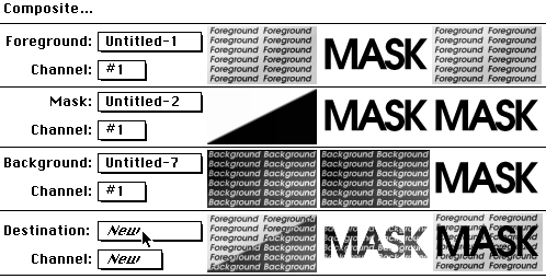
2. The key to Composite is the center pop-up, the "mask". It defines the outcome of the compositing action. Note that it is possible to use an RGB file as a mask, but for predictable results I suggest that you use a grayscale image.
>>> Here is the quick summary of it:
Wherever the mask is black, the background image (lower pop-up) is used,
Wherever the mask is white, the foreground image (upper pop-up) is used.
Shades of gray will use corresponding percentages of fore- and background.
A solid flat `128' gray as a mask would result in an even mix (identical to 50% Blend by the way) between fore and background images.
Here is a table with examples of the effects the mask can have:
fig 1) the Composite dialog in visual form: three sample setups and results
Note > if what you have to begin with are the complex Foreground and Background images, the first two results at the bottom could not easily be produced with alternative methods such as Paste!
Also note that simply assigning the mask to 2 of the 3 pop-ups yields simple yet often used results. In fact the "Big Letters composed of Small Letters" effect (center example) is often requested. You might want to play around with some of those combinations for a while.
3. Let's see how this applies to the current example:
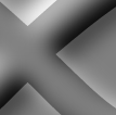
fig 2)
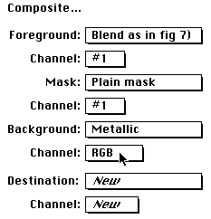
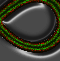
The Composite dialog setup to composite the metal into the background
Where the plain mask is black (the actual shape itself) we get the metal, where its white (everything else) we get fig 7) (as found in KPT #17, part one of this document). Since the mask is just black this is a simple `cut composite'. Still very useful.
Note > Don't forget to set the Channel pop-up to "RGB" in order to composite the full color image!
fig 3)
The result so far: a very clean composite of the inside shape with metallic texture sitting on fig 7)
fig 4)
A close-up of fig 3)
4. Very important is the fact that this really is a very, very clean operation. (and we are doing this in a tiny size really. Critical work might be at 4,000 x3,000 instead!) Have a look at this:
Anti-Aliasing!
fig 5 a)
 fig 5 b)

fig 6 a)
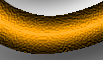 fig 6 b)
anti aliasing the mask yields automatically anti aliased composites
Crux Note >>> This simple fact is really very important, because it isolates the anti-aliasing step from the other operations. One can spend extra time to clean up 5a to 5b, knowing that one is abstractly really working on 6a versus 6b, but without actually messing around in the artwork !! Compare that to brushing and blending and blurring and whatever contortions people are going through to get 6a to look like 6b.
Also important note >>> the cleanup step from 5a to 5b came via the anti-aliasing routine in the text engine of Photoshop. If the initial logo shape had been scanned or sketched otherwise, the simple 2 step procedure outlined in KPT #4 ("Cleanup faxes and scans") should be applied. It will effectively take a "5a-like" hard edged shape and smooth the edges to look just like 5b.
In fact I consider it such an important tool and must-know for any Photoshopper that I would re-iterate the process here now. But as luck would have it we'll need the very same technique anyway for one of the cooler tricks of compositing.
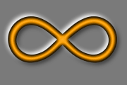
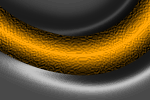
5. First lets create another metallic version of the background. Lets use a copy of the first composite we made ( fig 7) in the #17...) the one that looked like this:
fig 7)
the blended version before metal treatment...
The trick is to find a couple of areas that are to receive bright highlights. With the file from fig 7) open, go to the Image > Adjust > Arbitrary Map dialog. if you leave the dialog and roam around the window for fig 7) you will have an eyedropper cursor. note where the little circle in the ArbMap falls. (For a full explanation of the Arbitrary Map dialog, read KPT #8 ...)
6. You notice that around x=110 and 120 are the specular highlight areas. The picture below shows the dialog immediately after the Smooth button was used. In order to get it to look like this you would have to draw a horizontal line at 110 near the very top, maybe 10 pixels wide, and similarly at 120, not quite as high up....and also force the last shade on the right at 255 to 0! Then Smooth.
In order to make it more exact in following this, just load the Silvery.ArbMap file via the Open button right in the Arbitrary Map dialog.
fig 8)
the Arbitrary map to turn silvery...
It ought to look like fig 9) afterwards: silvery sheen with nice positive curvature... the teardrop shape is supposed to look like it is raised.
Notice that the logo shape itself got mangled in the process, including all kinds of ugly artifacts near the edges. This is precisely what I alluded to earlier: a) it is hard for a novice to focus on the inside shape and not get distracted by the colorful yet brutal events elsewhere in the picture. b) even though the effects resulted in harsh aliasing and pixellation, once you know the tools, you can rest comfortably knowing that you can extract what you need any time. Life is like that, too. Stop worrying.
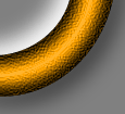
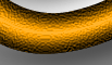
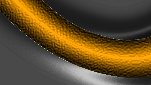
7. The metallic silvery sheen should look like this: (including the edge problems)
fig 9)
actual size chunk of the silvery inside shape
Again, looking at fig 9) the first impulse might be for some to grab the blur or the smear tool and start "cleaning" up the edges. First of all, in the algorithmic painting technique there should never be any need to do that, except for rare special touch ups (like adding a highlight dot in an eye or something) and in almost all cases including this one it wouldn't work very well anyway. You could tell in an instant that someone had mucked around with it...
I purposely used a fairly extreme method here to create aliasing (I could have done the silver sheen background on an earlier grayscale version before the gold was added...) because there are a number of operations that do create them and getting rid of them is an important part of this document.
8. If we used the same technique as before, Composite with plain mask, sheen and metallic as fore and background, you would find that the edge problem will look like this: (you don't have to do this)
fig 10)
dirt, or as the English might say, "naughty bits"
The BIG Note >>> The key technique to deal with this (and it happens a zillion times if you spend a zillion hours with this stuff as many of us do) is to modify the masks.
Here the mask is the black shape that cuts out the gold from a previous document. If we enlarge the mask just a bit it will steal a little more of the gold image and in so doing we will superimpose it smack over the aliasing problem pixels!
In a case where the two are not necessarily touching one could use two masks, one to cut out the gold and another to cut out the silver background. Then composite both of those onto yet another third image, which could be for instance merely solid black (or an otherwise unobtrusive color, or even a tiled cloned area of the other images...) It seems cumbersome, but those 3 steps can yield extremely complex and ultra clean pictures and it is still light years faster than any manual touch up, or trying to rope in the parts via selections and then pasting. More on that later
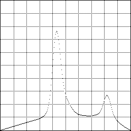
9. Make a copy of the original plain mask via Duplicate and then run Gaussian Blur at, say, 4....
fig 11 a)
 fig 11 b)

Before and after the Gaussian Blur filter
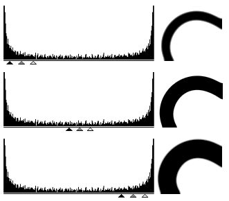
What we need to accomplish with this is to add more transitional grayshades to the mask, so that where it used to jump from black to white, it now steps through dozens of shades. This is only the preparation for step 2: with the Image > Adjust > Levels... dialog we can force those shades interactively to become black or white ! (The punch line of KPT #4)
Big Deal >>> That lets you control both the size and the sharpness of the edge ! And it does it in realtime so you can judge by trial and error.
10. In terms of growing and shrinking masks, here is the effect:
fig 12)
A blurred mask can be shrunk/expanded in the Levels... dialog
The way to do this is to move the black and white triangles inward (The gray one will then always follow along centered). If you set the triad roughly as shown here you can observe the two rules:
a) the distance between the triangles will determine edge sharpness. If you move much closer than shown here, the edges gets raspy and stairsteppy , any further apart and they get mushy and blurry. Simply watch the edge and move a little too far in either direction, then settle in between... Life is like that, too. Simply watch the edge and move a little too far in either direction, then settle in between...
b) the location of the triad of triangles (try it) will determine the overall size of the mask. You can blow it up at will or shrink it . The range here is determined by the initial amount of Gaussian Blur.
Notice that the center setting can be close to identical to the pre blurred original shape of 11a)!!! In fact this makes it clear that you can `grow' the mask from 11 a) in absolutely minute increments, almost sub pixel fine control (much finer and more realtime than things like magic wand tolerance settings)
Kind of important explanatory note >>> It is operations like Levels... that I greatly prefer to do with black mask shapes on a white background. In that I differ from the nomenclature and convention of Photoshop, which likes to think of a mask in original photographic `frisket' like terms: the black parts of a mask are obscuring the light and the white parts let it shine through. This is why in the Composite dialog the black part would be referred to as the `background' image, exactly opposite to my way of using it. I tried to change over just to synchronize on the names and to lessen the possible confusion factor I may introduce to others, but with best intentions I find myself time and time again gravitating back to black shapes for my masks. It may be less Photo-like, but it is the Mac way to think of objects on paper background, while white shapes on black look "inverted" to me. It is ultimately of no technical consequence and does not affect the process or quality one bit one way or the other, but many people before me have tripped over this and I felt it necessary to state it once.
11. The mask shape we need here is slightly larger: move the black triangle to `130' and the white triangle to `160' which is slightly to the right of center (the gray triangle's `1' position is at 127, mid between 0-255...the 8 bit range of grayscale images) (I cherish the thought of seeing 12 or 16 bits one day)
fig 13 a)
 fig 13 b)
The initial metallic gold and silvery sheen files become the fore and background of Composite...
fig 14)
and the larger smooth edge mask creates this very clean combination...(compare to fig 10 !)
Quod erat demonstrandum...
There is lots more still, both about masks and compositing, as well as Channel Operations.
So part 3 is coming right up....go get it.
I hope you don't find all this overly confusing and complicated. It isn't really, once you get into the swing of it. The feedback files I have received in the last 6 months do express that. Many people have gotten to feel much more comfortable with the techniques after a little while.
Plus, I think Albert said it rather succinctly:
"Things should be made as simple as possible, but not simpler!"
have fun, Kai
Please tell Compuserve and Adobe if you found these tips, but then you lost them and they are nowhere to be found. Maybe they can help you look.